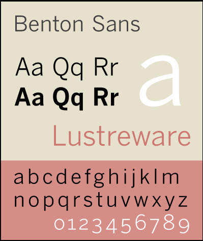
This month we have chosen Benton Sans as our favourite font. From the same classic font families of Franklin Gothic and News Gothic, it’s a straightforward sans font with a more contemporary look, but is not so straight that it loses style like some sans fonts I could mention! Because of its many weights and forms (italic, condensed…) it is able to function as both body copy and in larger display sets, headline etc so very versatile.
The Benton Sans® typeface from The Font Bureau, Inc. has a history of design and development that spans an entire century. Developed as a re-imagining of Morris Fuller Benton’s 1908 classic, the News Gothic™ typeface family, Benton Sans retains much of the workhorse flexibility of its predecessor, while introducing new features and refinements unavailable in the original design. With a wide range of weights and styles, Benton Sans has gained popularity in publishing and many other forms of print media. fonts.com
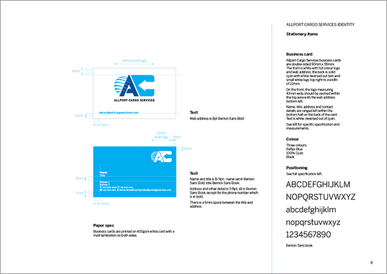
Rolph & Floyd have used it for a variety of work projects. Ongoing marketing material for Boycott & Aggers for Simon Fielder and a re-brand for Allport Cargo Services both utilise Benton Sans as their core font.